

Is your bathroom feeling a bit drab?
One of the easiest ways to spruce it up, even before a renovation project is to add a fresh coat of paint. Never underestimate the power of a new tone or a change in colour scheme – it can be just what you needed to give your bathroom a quick facelift or to take your renovation plans to the next level.
When it comes to choosing which colour tones will be the best fit for your home décor, there’s plenty to consider. That’s where we come in. Below is a breakdown of all the key considerations and notes to keep in mind when you’re picking out your new scheme. Cool and collected or bright and unconventional? Read on to find out what you should do.
Keep your space in mind

Photo Credit: Schumacher
This first one is huge.
When you’re looking through our website or Pinterest for home décor ideas, it’s easy to fall for a space and a colour scheme that’s entirely different from the space you’re working with. When you’re getting inspired, try spending your research time in your bathroom. Lots of the glamorous bathrooms online have huge windows, tons of light, amazing ceilings, or tons of square footage that yields a bit more flexibility in design.
That’s why it’s critical to make the most of what you have, not call attention to what you don’t. Small bathroom? Try a soft green, cream, light grey, pale blue, or even pink. These soothing tones will help boost any natural light you have in your space, bouncing it around and creating an open and airy feel. The following paint colours also work wonderfully with small bathrooms as well:

Photo Credit: Apartment Therapy
Follow the rule of three
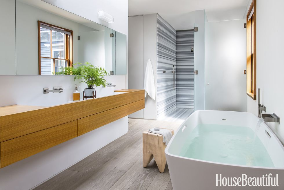
Photo Credit: House Beautiful
When it comes to choosing colours, restrain yourself to three different tones.
This should include a neutral, a rich tone, and an accent. It isn’t to say that your accent colour can’t take centre stage, or that your bathroom colours have to be boring, but choosing too many bright tones or too many accents can become busy and overwhelming, particularly in small spaces.
It also helps to look to the rest of your home to get ideas around which colours to choose. Working in one or two of your colours pulled from other areas of your home décor will help your newly painted bathroom feel connected to the rest of your house.

Don’t be afraid of your dark side

Photo Credit: Brett Foken
Think dark tones don’t belong in a bathroom? Think again.
It’s true that light and soft tones make your bathroom feel effortlessly airy and larger than reality, but dark colours can have a time to shine too. If your space has high ceilings or lots of square footage, don’t be afraid to experiment with darker tones. Especially as an accent colour, dark tones in a bathroom can make an unexpected, yet completely welcome, splash.
Here’s a look at some of the most highly recommended black paint options from Benjamin Moore:

Photo Credit: The Room Changer
Be strategic with which colours you choose, but also where you place them

Photo Credit: Pinterest
In our first tip, we mentioned the importance of keeping your space in mind. This concept comes up again here, and there are tons of ways to be strategic with colour placement to trick the eye into seeing larger, brighter spaces.
Start by always looking at paint swatches in your bathroom before you make a final decision. The light in different rooms of your home (and at the paint store) will affect how the paint swatch looks. Seeing it in your bathroom is the only way to create an accurate colour palette and to know how all your colours are actually going to come together.
It’s also important to use colour strategically within your space. If you want your ceilings to look higher, use the same light colour on the walls and the ceiling. Harsh breaks in colour at the ceiling line (or any trim or door, for that matter) cut off the visual, whereas an all-over colour draws the eye upwards and around.
Now that you’ve got a handle on what colours to choose, you might become inspired to take on a bigger renovation project.
Make sure to follow us on Pinterest for more design and renovation inspiration!